

I'm going to try and post Photoshop "how-to's"...
how about... on Wednesdays?
I have my reasons, but mostly because iPhotoshop, and you should too.
most of it has been learned on my own, with a few painful classes along the way.
It is the epitome of a love-hate relationship for me.
EXAMPLE:
me & in n out.
me & snow.
You get the idea.
So please enjoy this post, tell your friends, and try it next time you want to make
your invitation just a little bit more fancy.
1. Create a new document in Photoshop.
File > New
Any sized document will work, but for this example I've chosen to just work
on a 5 x 5 in canvas.
Any sized document will work, but for this example I've chosen to just work
on a 5 x 5 in canvas.
2. Change the foreground color of your canvas to an off-white or other light color. For this example, I'm using #cfccc.
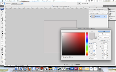
Choose background color, and then apply by hitting
Option/Alt + Delete
Option/Alt + Delete

3. Add Texture.
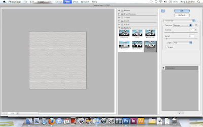
We want the invitation (or whatever it is you crazy people are doing) to have a softer, more realistic texture. You can find your own here at one of my favorite websites and apply it as a filter, or use a Photoshop texture, which is what I'm doing.
Choose Filter > Texture > Texturizer
I'm going to keep the Canvas texture, but I've changed the scaling down to 87%,
and the relief scale down to 3.
and the relief scale down to 3.

Play around with the options until you're happy with the texture.
Burlap works well too.
Press OKAY.
Burlap works well too.
Press OKAY.
4. Add type to your canvas.
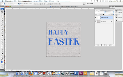
Bold, thicker fonts work well for letter press, but as fonts are VERY expensive,
websites like these offer free fonts for downloading.
In fact, I'll use the font RiotSquad from dafont.com, but any other Retro type fonts
tend to work well too.
websites like these offer free fonts for downloading.
In fact, I'll use the font RiotSquad from dafont.com, but any other Retro type fonts
tend to work well too.
Choose a bright font color, so you'll be able to see the letter press.
I've used blue #396dcc.
I've used blue #396dcc.

5. Add an "inner-shadow" to your text.
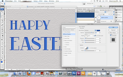
On the layers menu at the bottom:
fx > inner-shadow
fx > inner-shadow
Change the color of the shadow from the default black (black is much too harsh for this the effect you're going for), to a color a few shades darker than your original color. The effect should be subtle.
Change the opacity to 70%.
Change the opacity to 70%.

Hit Okay.
6. Add texture.

Since the last filter you applied was the same for the paper, you can hit
(on a MAC) Command + F
(on a MAC) Command + F
or
Filter > Texturizer
Filter > Texturizer
(You may receive a warning message asking you to rasterize the image, hit OK)

7. Finish.

For finishing touches, I ran the dodge tool over the center of each letter, with a highlight effect.
Feel free to try other finishes, until you get the look you want.
Let me know if you want a specific tutorial, we'll try to get it on here!
And if I don't know it, I'll learn it. For you.
Merry Easter!
Feel free to try other finishes, until you get the look you want.
Let me know if you want a specific tutorial, we'll try to get it on here!
And if I don't know it, I'll learn it. For you.
Merry Easter!


No comments:
Post a Comment